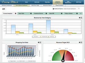
 Summary: While a business dashboard will help you make sense of your data, not all dashboards are created equal. Many lack key features that modern businesses require. In this article, we explore which features you need in a modern dashboard, and why they are so important.
As data volumes rise, business dashboard adoption has skyrocketed. Dashboards help businesses make sense of their data–turning mountains of information into actionable insights. They alert leaders to business problems, and can help stop issues before they get out of hand.
 The problem: Not all dashboards are created equal. Some are inflexible. Others are hard to use. Still others offer limited features.
If you’re looking to implement dashboards, or replace your existing dashboards, what features should you look for? Besides charts/graphs, what should a modern business dashboard include?
Today, let’s answer those questions. Here are 7 features that you should look for in a modern business dashboard.
1. Drill downs
A dashboard gives you a high-level view of your data. But, it should let you drill down into more information if needed.
For instance, suppose a chart on your dashboard tracks real-time product sales. It should let the user drill down to see which products are selling best, where they are selling, and any other pertinent information.
“Executives first and foremost typically want to get a grasp on the big-picture/overall health of a company,” explains Carl Forrest, Co-Founder of DataSetGo. “This is the Macroview. Ideally, you want to present your high-level, aggregated data in this view. Metrics like: month-over-month and YoY change in sales, sales volume, or churn are common metrics that fit this description. Broadly speaking, you want to create a snapshot of a few high-level KPI’s.
Next, you want to get more granular with the data. This is where you dive in and explore what’s beneath the macro-changes. A simple example of this Macro to Micro transition would be:
- Last Month’s Gross Sales by Geographic Location (GeoMap)
- Gross Sales Change MoM (Line Graph showing time by day or week)
- Sales Segmentation of Monthly Sales MoM by dept or product line (Segmented Line Graph)
- Product ID sales MoM (these are the individual units in your inventory)
Data tells a story. This Macro-to-Micro narrative is a useful framework to explore that story.
Exploratory data analysis allows for interactive data visualization where you can bombard a data visualization with ad-hoc business questions. Static Excel charts and repeatedly running time intensive reports aren’t useful anymore.”
2. Cross-Platform
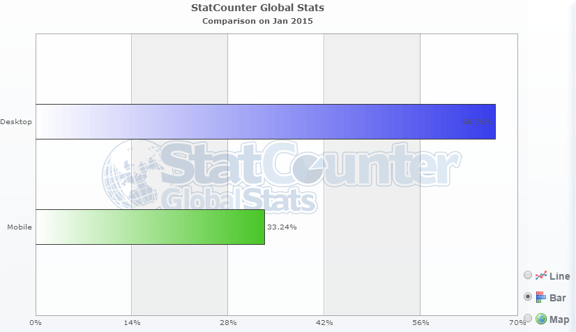
Over the past 5 years, mobile devices have moved from a luxury item to a necessity. They’re quickly overtaking the desktop PC.
Let’s take a look at the stats. Since 2012, mobile browser usage has jumped from 8% to 33%. Meanwhile, desktop browser usage has fallen from 92% to 66%. Expect those trends to continue over the next few years.

What does this mean for business? Any application you create or implement (dashboards, reports, etc…) must adapt to all platforms. In this increasingly mobile-driven world, users must have the option to access their dashboards from anywhere.
3. Customization
With dashboards, one size doesn’t fit all. Different users want to see different data. Or, they may want to see the same data, but organized differently.
Yet, I still see many businesses creating static dashboards for their users. If different users want different information, they’re stuck creating separate versions of the same dashboard. This not only wastes time, it frustrates the users.
Instead, deliver customizable, user-defined dashboards. This lets the IT department create a single dashboard that users can customize to meet their needs. These dashboards let the user pick and choose which data to display, and how to display it.
“Business / Executive dashboards are designed to be multi-purpose, and typically provide the end user with the ability to “customize” their desktop, given the role they perform, or the information they’re particularly interested in,” says Tom Hart, Chief Operating Officer at Eliassen Group. “For example, the leader of sales for the company may be interested in product sales by sales person, or by product, or by geographic territory or region. Whereas the head of operations in a manufacturing environment may want to see total unit production for a given week, the number of defects identified coming off the production line, how the number of defects stacks up against historical information, etc. The CEO of the company may have an entirely different looking dashboard, with high-level or summary metrics reflecting current and trended performance for each of the divisions underneath him or her.”
4. Saved views
When you give users a customizable dashboard, what’s the next feature they’ll ask for? Saved views–the ability to save specific dashboard customizations for quick access later.
For instance, suppose a user wanted to create region-specific dashboards. Rather than filter and customize that dashboard for every region every time, they can create a saved view for each. This lets the user select the saved view they want to access, without going through the trouble of building it every time.
5. Clear organization
I’d say that the number one feature is a fundamental, structural feature following under the heading great design,” says Jack Beacham, General Manager at Aventure Works, Inc. “Great design, in this case, means hierarchy and focus upon the very few most critical aspects of a business. Rather than a single page of 20-100 KPI’s, the dashboard is best if it allows the user to focus in on, say, the five very most important, and within those five, the single most important. The hierarchy should be visibly displayed – the most important at the top and with proportional view-port real estate to convey its overwhelming significance. The hierarchy should be reinforced and simplified by an ability to drill down deeper and wider as the user’s brain is asking questions and searching for evidence.”
This is a common problem with dashboards. Rather than choose the most important elements, businesses cram an overwhelming amount of data into a single dashboard. This negates the power of dashboards–simplicity.
“If your dashboard does not fit on one page, you have a report, not a dashboard,” states Avinash Kaushik in his article “Five Rules of High Impact Web Analytics Dashboards.
“This rule is important because it encourages rigorous thought to be applied in selecting the golden dashboard metric,” he says. “It acts as a natural barrier to cramming in too much information, makes data presentation easier, makes the dashboard more understandable.”
Now, clear organization and design largely depends on you. If you choose to stuff your dashboard with unnecessary data, it will likely overwhelm your users.
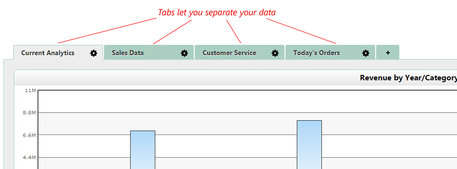
But, dashboard software should provide organizational features to help you create clear dashboards. For instance, what if you need to separate different types of data in your dashboard? Or, what if your users demand more data than can comfortably fit on one screen?
In these cases, the ability to create tabbed dashboards is essential. A tabbed dashboard lets you segment different data categories into separate tabs. It helps you create organized dashboards that don’t overwhelm the users.

6. Intelligent alerts
Dashboards help you keep a close eye on your business. They let you instantly spot (and fix) problems as they arise.
But, what happens if you’re not constantly looking at your dashboard? How can you spot problems?
A good dashboard should provide the option to set up intelligent email or SMS alerts. You can set these alerts to notify you if your data exceeds or drops below a certain threshold. These instant alerts will help you address problems as they happen.
7. Row-level security
Row-level (or multi-tenant) security lets you control user access on a per-row basis. You can control which users or roles can access which rows within a single application.
Why is this important?
Without row-level security, you must create separate dashboards for every user role. It’s a lot of work. Imagine the effort required to create and maintain different dashboards for different users. I remember one company that was creating 25 different dashboards on a regular basis.
How does row-level (or multi-tenant) security fix this problem? It lets you create a single dashboard for all users, yet limit their data access based on their role.
For instance, a sales manager and a sales representative may access the same dashboard, yet see different data. Or, different sales reps can access the same dashboard, yet only see their sales data.
Summary
These are just a few essential dashboard features, but there are plenty more. If you would like to add anything to this list, I’d love to hear it. Feel free to share in the comments.
I feel that, real-time dashboards aren’t the place for complex or advanced data visualizations. They should provide a simple representation and easily understandable. It should also offer seamless data integration and connection to multiple sources.
Hi Joe, very insightful article about the features of business dashboards. It’s a must read and would definitely share with our customers.
Your article gave me a clear idea of how we can improve our software.
I mostly get to hear from our customers that they used to find themselves entangled in between multiple tools. They felt that the majority of their time got consumed in managing data stored at different places and weren’t able to sync in with teams.