Dashboards should make your life easier. Many don’t.
What happens? Some try to show everything at once…without really showing anything useful. Others take months to build and still don’t have the right data. Yet, making a change might take weeks. I could go on.
The good news? Dashboards have come a long way. They’re accessible from anywhere. They update in real time. And with the right tools, you can build one in a day—not a quarter.
In this article, you’ll learn how to build web-based dashboards in minutes that actually help people do their jobs. We’ll cover different types—like KPI dashboards, executive dashboards, and other business dashboards your different teams might use. You’ll learn some best practices, mistakes to avoid, and the best approach to development.
Sounds good? Let’s get started.
What Is a Web-Based Dashboard?
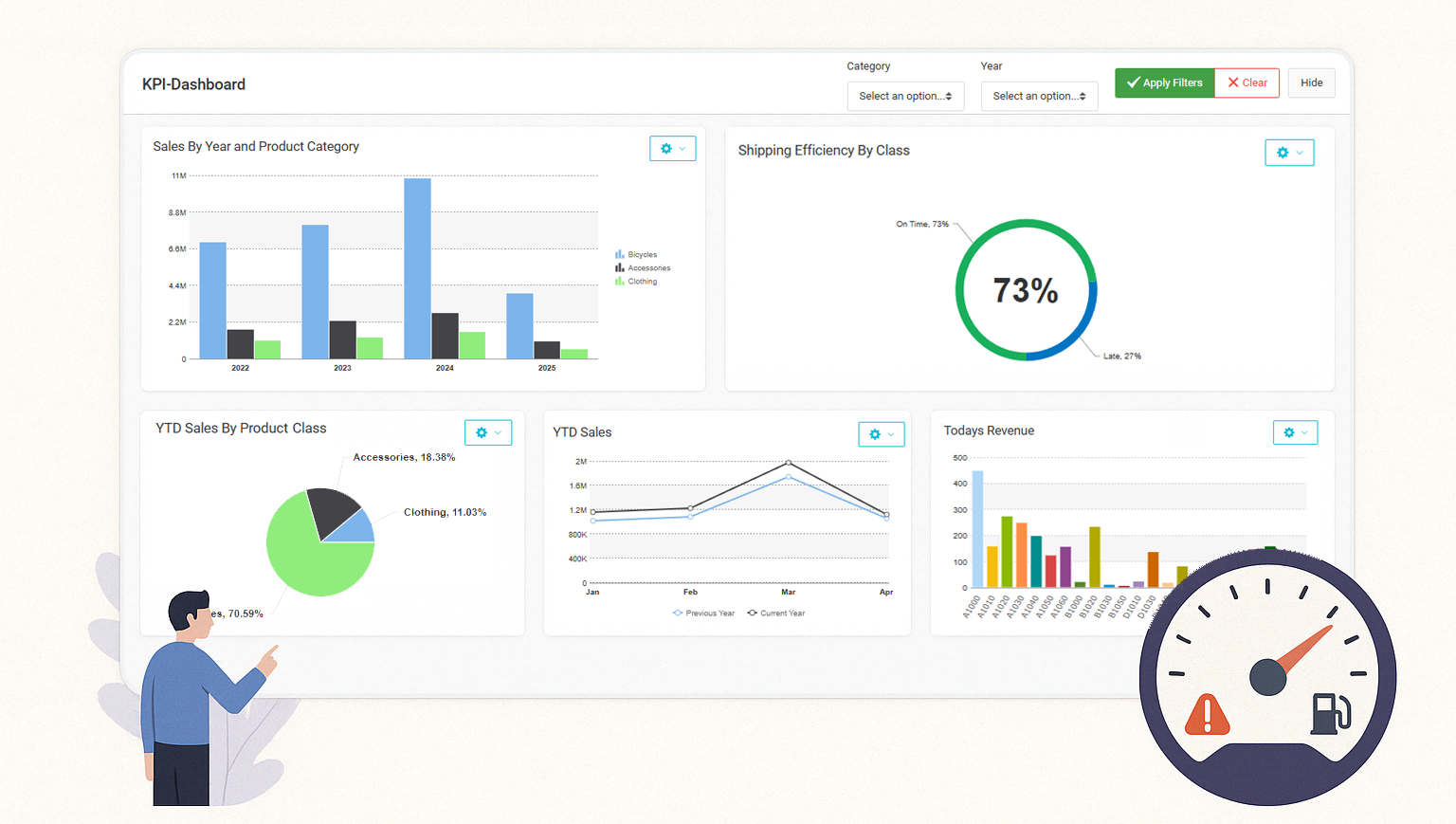
First things first: Let’s define the term. A web-based dashboard is a web application that visualizes different key data points on one page. It pulls live data from your database(s) and displays it in charts, tables, and visuals.
In short, it’s a business intelligence tool with a single goal: Improve data driven decision making.
Here’s a good analogy: Dashboards are like the instrument panel in your car. You don’t want to know everything the engine is doing—you just need speed, fuel, and maybe a warning light before things explode. It’s the same idea.
When done right, they help you monitor performance, spot trends, and improve decision making. They eliminate the need to dig through spreadsheets or wait for weekly reports. You have the data you need at your fingertips.
Executives use business dashboards to track goals. Operations teams use KPI dashboards to monitor performance. IT teams use them to prove nothing broke today. Dashboards serve different purposes and are often built for specific departments or groups of users.
Bottom line: A good dashboard turns raw data into actionable data that drives decisions. A bad one turns it into headaches.
Types of Dashboards You Can Build
As touched on above, dashboards aren’t one-size-fits-all. There are many types – each serving a specific purpose. For instance, a CFO doesn’t care about server uptime. Your IT manager probably doesn’t need to see quarterly sales trends—unless something’s broken.
In other words, a good dashboard doesn’t try to be all things to all people. It has a very specific purpose, user type, and metrics. Here are some of the main types you’ll run across:
1. KPI Dashboards
These track your Key Performance Indicators (KPIs), which are metrics that measure business performance relative to goals. In other words…metrics that matter to your organization. If it’s tied to a specific goal, it belongs on a KPI dashboard.
Good KPI dashboards are simple and clear. They don’t try to show everything, only numbers that move the needle.
2. Executive Dashboards
An executive dashboard gives leadership a high-level view of the business. It pulls in KPIs across various departments and shows how the business is performing against its goals.
Fast insights are the name of the game here. Executives don’t have time to dig through reports or chase down spreadsheets to find important metrics. An executive dashboard shows them what’s working, what’s not, and where to focus next.
3. Operational Dashboards
An operational dashboard shows what’s happening right now. It monitors day-to-day activity and alerts the right people to anything that needs attention. They update in real time or near real time and helps your company stay ahead of issues.
For example, they show things like active orders, support tickets, machine uptime, inventory levels, etc… If something is off in your day-to-day operations, an operational dashboard will let you know.
4. Analytical Dashboards
An analytical dashboard aims at exploring data, spotting trends, and finding patterns you can’t see at a glance. It pulls from large data sets, applies filters, and lets users slice and dice information across time, categories, or dimensions.
Analytical dashboards often contain a lot of data and run a bit slower than most dashboards. That’s by design. They’re aimed at enabling data discovery, and giving you the features to view data from any angle.
5. Custom Dashboards by Department
A custom dashboard is built for a specific department or group of users. It shows only the metrics that matter to that team—and hides everything else.
For instance, the sales department might care about pipeline and close rates. The finance department watches budgets and margins. IT keeps an eye on system health and support tickets. Each has a custom dashboard geared towards their needs.
Dashboard Design Best Practices
A dashboard is only useful if it’s easy to understand and delivers on its primary purpose. Otherwise, it’s little more than charts on a page.
For example, a dashboard app that crams too many charts into a page will just overwhelm users. Likewise, those that try to appeal to everyone will likely appeal to no one.
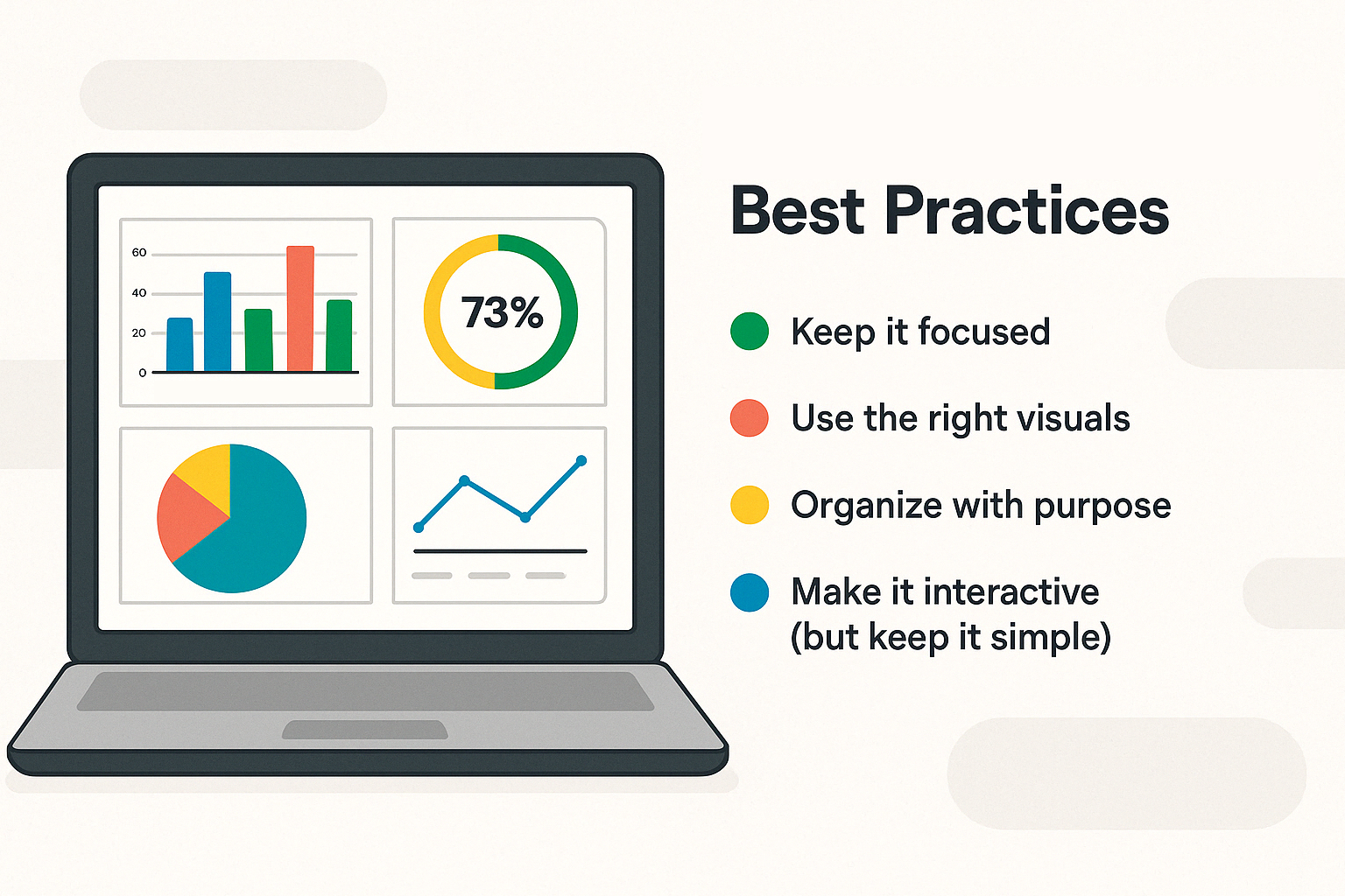
How can you create effective dashboards that people actually use? Here are a few best practices:
1. Keep It Focused
Each one needs a purpose. Before you start designing, ask a few questions:
- Who is it for?
- What is the user’s goal?
- What decisions should this support?
- Which metrics drive those decisions?
Then work backwards from there.
Don’t overload it with every available metric. A cluttered dashboard makes users sift through noise to find what they need. Focus on metrics that actually drive decision-making. If a metric doesn’t support a specific goal, it probably doesn’t belong on the page.
Tip: Limit yourself to one screen’s worth of content. If you need more than that, you’re probably trying to solve more than one problem.
2. Use the Right Visuals
The wrong graph or chart type can confuse more than it clarifies. Choose visuals that match the data’s story.
- Line charts show trends over time—perfect for revenue growth, site traffic, or helpdesk ticket volume.
- Bar and column charts work best for comparing categories, like sales by region or customer type.
- Tables are ideal for detailed data that needs exact values, like open invoices or pending orders.
- Gauges and scorecards highlight progress toward a target—great for goal tracking.
- Pie charts work best to emphasize proportions among a small number of categories, like market-share between competition or high-level budget allocation.
Rule of thumb: If a user has to stop and think about what a chart is showing, try something simpler.
3. Organize With Purpose
Generally speaking, organization problems stem from dashboards that try to do too much. They try to fit as much as they can into a single screen, resulting in a cluttered mess.
When it comes to dashboards, layout matters. Organize metrics by importance. Place high-level metrics at the top—what users need to see first. Group related KPIs together so users can scan logically from one section to the next.
Use whitespace to separate sections. It’s not wasted space—it gives the eye room to breathe and reduces cognitive load.
Keep filters and buttons in familiar locations—usually across the top or left side. Don’t hide them. If users can’t find how to filter the data, they won’t.
Think of your layout like a conversation. Start with the big picture. Then go deeper. End with the details.
4. Make It Interactive (But Keep It Simple)
Interactivity adds value when it gives users flexibility. Adding filters, drop-downs, and drill-downs lets them explore the data in a way that’s relevant to their role or question.
But don’t go overboard. Too many options can make dashboards feel more like a tool than a quick insight hub.
Use interactivity to:
- Filter by date ranges or departments
- Drill into details from high-level KPIs
- Toggle between chart types or data sets
Just make sure these features are intuitive. If users need instructions to interact with your dashboard, it’s too complex.
5. Design for All Devices
Not everyone views dashboards from a laptop. Executives often pull them up on tablets. Field reps use their phones. If your layout only works on a widescreen monitor, you’ve already lost part of your audience.
Make sure your layout is responsive. Charts should resize gracefully. Text should stay readable. Controls should still be usable on a touchscreen.
Test it on different screen sizes before rolling it out. What looks great on your design screen might fall apart on a phone.
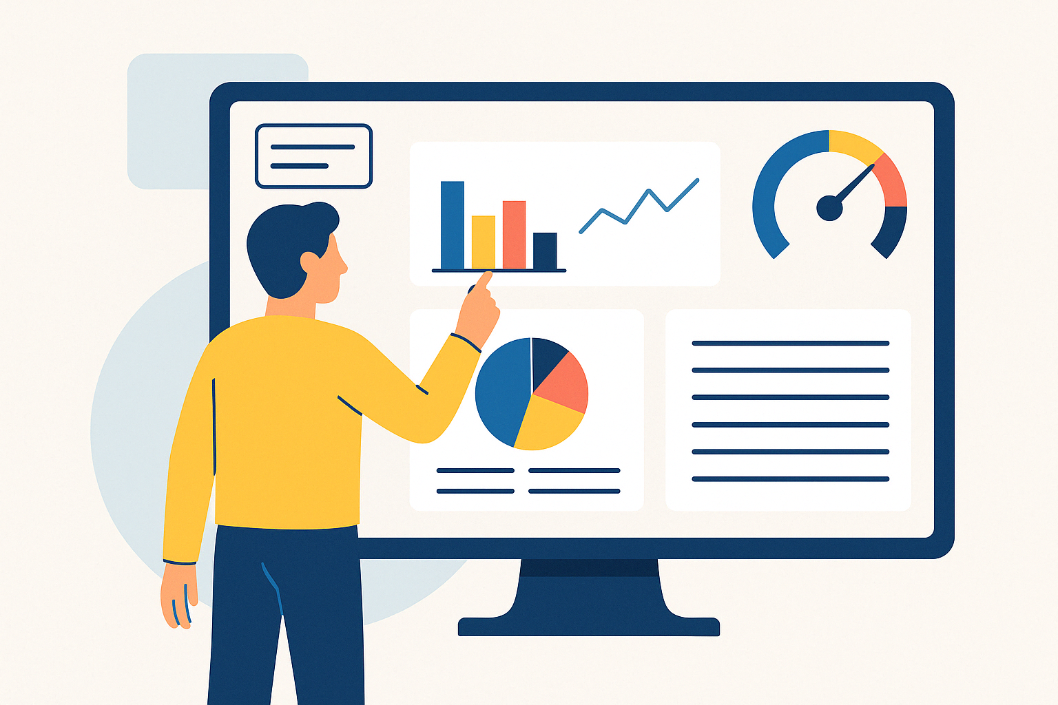
Good dashboards don’t just show data—they make it useful. With solid design, you’ll reduce confusion, increase adoption, and help your users get what they came for: clear answers and faster decisions.
How to Build a Dashboard (Step-by-Step)
You don’t need a massive dev team—or weeks of back and forth—to build your own web dashboard. With the right tools, you can create dashboards in hours, not months.
Here’s how the process works.
Step 1: Define Your Audience and Goals
A good dashboard is built around the user. Who needs it and what do they want out of it?
Don’t guess what they need. Do your research. Go and talk to the users. Understand their goals, needs, and technical skill level. What do they want out of this dashboard?
Of course, users may not exactly know what they want. Or, they may not understand what’s possible. Provide suggestions and guidance when needed.
One more thing: Understand your security needs and user access requirements. Should every user have access to the same data?
For instance, suppose the sales department needs a dashboard. Each salesperson needs access, but each should only be able to see their own sales numbers.
Does this mean you need a different dashboard for every salesperson? Thankfully, no. Many tools include multi-tenant security features. They secure data access at the row level, ensuring that different users can login to the same dashboard yet only see the data they’re authorized to see.
Step 2: Identify Your Data Sources
Next, figure out where the data lives in your environment.
Are you pulling from a relational database? A spreadsheet? An ERP system? A data warehouse? Do you need a single source of data, or different sources?
Most importantly: Make sure your data is clean, current, and structured. A dashboard is only as good as the data behind it.
Step 3: Select Your Key Metrics
Too many web dashboards are cluttered with vanity metrics. They look nice, but don’t drive action. Rather, you want a dashboard filled with actionable insights.
How do you tell them apart? Ask yourself one question: Would a change in this metric (either up or down) lead to a decision? If the answer is “no”, leave it off.
Here’s an example for you:
A vanity metric on a customer service dashboard might tell you how many customer support issues were resolved this month.
Does that tell you anything that can drive action? Probably not.
Now, consider a metric that displays WHICH issues customers contact your support staff about. The web dashboard could even display average time to resolve every type of issue. That’s data that drives action. You can quickly see which areas of your product or service needs attention.
Step 4: Choose the Right Visualizations
The way you present your data can make or break its impact. A well-chosen graph/chart doesn’t just look better, it makes the information easier to understand and act on.
The best approach? Start by asking: What question does this data answer? Then choose the format that delivers that answer with clarity.
Here are some common use cases and how to visualize them:
- Line and area charts — Ideal for tracking changes over time. Whether you’re analyzing monthly sales, support ticket volume, or energy consumption, these charts make trends obvious at a glance.
- Bar and column charts — Use these when comparing categories or groups, like sales by product line or department performance within your company. They’re excellent for showing differences across segments.
- Tables — Sometimes, exact numbers matter. When detailed records, transactional data, or itemized lists are needed, tables provide a clear and familiar layout—especially when paired with filters.
- Scorecards — These are great for visualizing single values that represent progress toward an objective. Think of things like current revenue, conversion rate, or order volume. These work best when you want to highlight something quickly, without extra interpretation.
- Gauges — These visual elements give a quick read on how close you are to a specific goal. They’re often used to monitor thresholds, such as sales goals or project completion status.
Not every visual belongs in every application. For instance, pie charts can work—but only when showing a small number of categories with clearly distinct proportions. If it takes more than a second to spot the largest slice, it’s probably time to switch.
A balanced layout often includes a mix of components: a few visual summaries, a detailed table, and maybe a time-based graph. The goal is to support decision-makers by delivering data that’s both accurate and easy to interpret.
When you create your web dashboard app or analytics interface, consider who’s reading the information and what they need from it. Not everyone wants deep analysis. Sometimes they just need a single number. Sometimes they need to explore further.
Choosing the right visualization is the difference between information and insight.
Step 5: Add Interactivity
A well-designed interface should start with a clear overview, and then let people dig deeper when needed. The key is interactivity: filtering, drilling into details, and letting each person explore the data however they wish.
Start with the essentials. Offer dropdowns to adjust views by date, department, region, or category. Add clickable elements to reveal underlying figures without cluttering the main screen.
For example, if you’re tracking product returns, don’t just show the totals. Allow people to filter by store location or click into specific graphs to uncover return reasons and patterns. That kind of layered insight turns basic reporting into something actionable.
Interactive elements help different roles get what they need, without changing the layout for every use case. Sales might zero in on products. Operations might want to see patterns by location. One application can serve both if it’s built to respond to context.
Keep it simple. Interactivity shouldn’t overwhelm. A few meaningful controls go a long way.
In the end, it’s about giving decision-makers room to explore, without making them dig.
Step 6: Build and Deploy
Once the pieces are in place, it’s time to pull everything together. Preview your application. Check the layout across devices—laptops, tablets, phones—to make sure it adjusts smoothly and data refreshes as expected.
Once it’s ready, deploy and share it with your audience.
Deployment shouldn’t be a process full of friction. When everything’s built right, rollout is simple—and so is access.
Step 7: Get Feedback and Improve
After launch, check in with your users. What’s working? What’s missing?
Dashboards aren’t static. You’ll find things to tweak. KPIs shift. Priorities change. A good dashboard evolves with the business.
Want to see it in action? Here’s a video walkthrough of how to build a dashboard with m-Power:
Why Low-Code Platforms Fix What Traditional Dashboard Tools Get Wrong
Traditional dashboard development sounds simple on paper. Pull some data, build some charts, ship it. In reality? It’s a slow, resource-heavy process—and often frustrating for everyone involved.
Here’s what usually happens:
The Problem With Traditional Dashboard Tools
- Hard-coded dashboards are slow and expensive
Every change—new KPI, layout tweak, filter—requires dev time. Multiply that across departments and projects, and dashboards become a maintenance headache. - BI tools are built for analysts—not decision-makers
They’re powerful, yes. But most execs don’t want to learn a new interface or navigate six menus to get to a sales number. They want clarity. Fast. - IT gets buried in dashboard requests
When business users can’t make changes themselves, every update funnels through IT. It’s a backlog generator disguised as a reporting tool.
Why Low-Code Platforms Work Better
Low-code platforms change the game by cutting out the inefficiencies—without giving up flexibility or control.
1. Faster Development Without Shortcuts
Low-code doesn’t mean low quality. It means you don’t waste time rebuilding the basics. You get prebuilt components for charts, filters, security, layout, and interactivity—so you can focus on the important parts.
You can still customize everything under the hood, but you’re not starting from scratch every time. And, you’re building enterprise grade solutions.
2. Direct Access to Live Data
Low-code platforms like m-Power connect directly to your databases—SQL Server, Oracle, DB2, MySQL, and more. Your dashboards stay accurate, provide real-time data, and are tied to a single source of data.
There’s no need for manual data entry or worrying about data quality. That means fewer sync issues, fewer delays, and less complexity.
3. Custom Dashboards Without the Custom Coding
You can build all types of web dashboards (executive, KPI, operational, etc…), all without writing full front-end code. Business users get the insights they need. IT gets a break.
Need to adjust a filter or add a new metric? You won’t need a sprint cycle to get it done.
4. Reusability at Scale
Once you’ve built a layout, connected a data source, or defined a filter, you can reuse it across multiple dashboards. You’re not reinventing the wheel every time a department wants “their version.”
Think of this like reusable building blocks. The more blocks you create, the simpler future projects become.
5. Governance + Flexibility
Low-code doesn’t mean giving up control. IT sets the rules, manages access, and ensures security (many even provide single sign-on). But power users can explore, tweak, and build within those guardrails—without flooding your inbox with requests.
It’s self-service analytics, but with structure. This is especially helpful for businesses that must follow compliance laws. They are in complete control everything, right down to the data.
6. Build Anything
While some low-code tools are geared specifically towards dashboards, many let you build any type of web application over your database(s). That means you use one platform for reports, dashboards, and any other type of web application your company needs.
After all, why buy a bunch of single-use software when you can have one piece of software that builds anything? There’s no need to waste time making a bunch of different tools work nicely with each other. With a low-code tool, you create and deploy any web app you need with the exact features you want.
Take a tool like m-Power, for instance: Our customers save time on app development. They create reports in minutes to analyze their data. Many even publish their reports and apps in portals for their clients. The best part: It’s built to fit seamlessly into their current environment.
Bottom Line
Traditional tools can’t keep up with today’s pace. You either move slow and stay in control—or move fast and lose consistency.
Low-code dashboard platforms give you both. You speed up delivery, reduce technical debt, and still build dashboards and reports that are fast, flexible, and actually used.
That’s how modern teams stay ahead of the data—and not buried under it.
Conclusion: Dashboards That Drive Action, Not Just Reports
A dashboard isn’t just a report with charts. It’s a business intelligence tool for visibility, analysis, and faster decisions. When it’s designed well, it keeps everyone on the same page. When it’s built right, it adapts with the business—not against it.
But that only happens when you have the right foundation.
Web-based dashboards give your teams access from anywhere. Custom dashboards deliver the right data to the right people. And low-code platforms give you the flexibility to keep up with demand—without increasing the workload on IT.
The bottom line: building powerful dashboards shouldn’t be complicated. With the right tools and the right approach, it isn’t.