All of m-Power’s Bootstrap themed templates incorporate the idea of responsive design. When working with grid based templates (like the Multiple Row Data List retrieval or the Grid Update maintainer), out of the box the presentation tries to fit as many columns on the screen as possible, meaning the spacing (width) of the columns is dynamic and automatically determined by how many other columns are in the presentation.
In cases where developers add many columns to the data table, they may want to manually specify their columns widths. This post will discuss how to do so via the m-Painter editor.
Adjusting columns with HTML inputs
This example shows a stock Grid Update maintainer, which due to the large amount of data within the last column, causes the other columns to have their width re-sized in a smaller than desired amount.
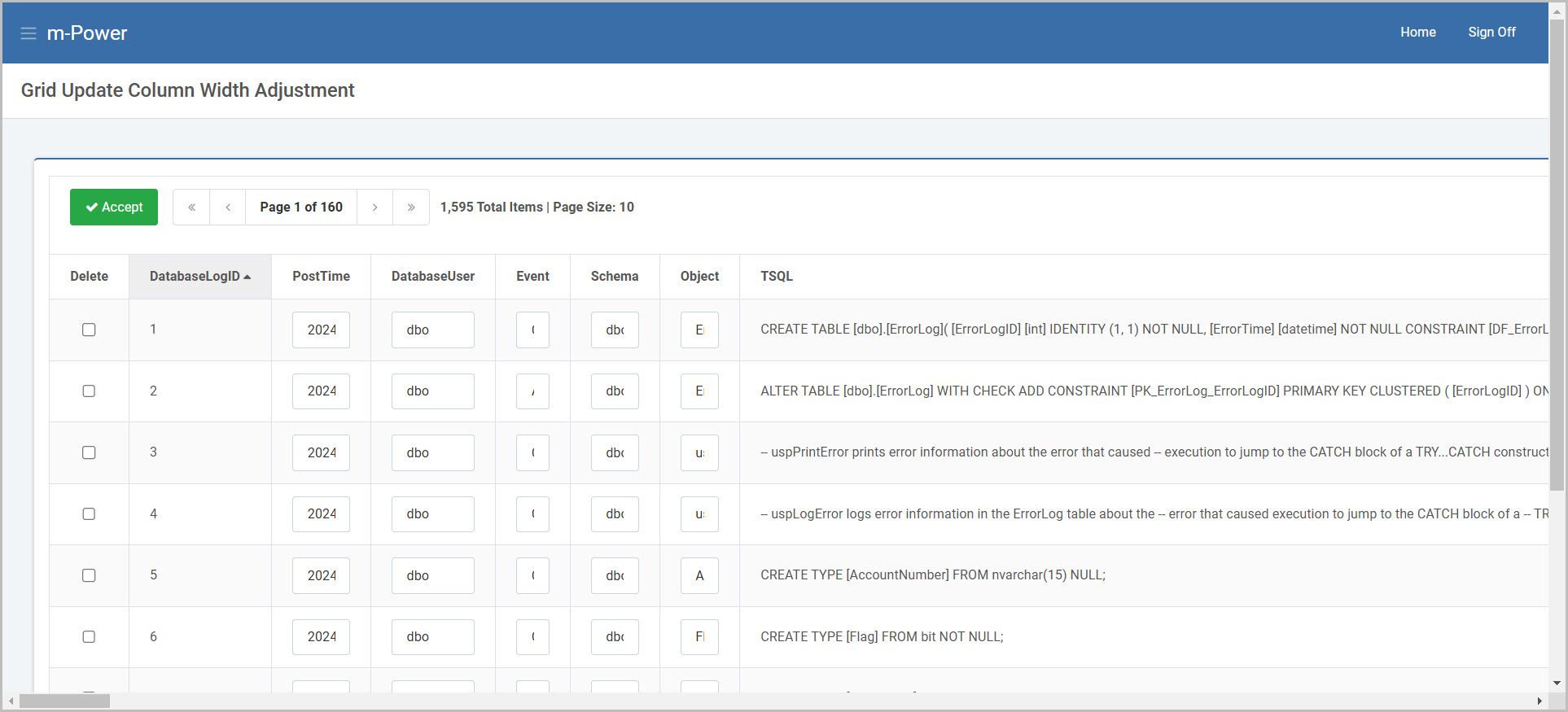
The goal will be to increase the size of the columns so my user can appropriately type within the input box.
In the m-Painter editor, open the ‘CSS’ pane associated with the application. Add the following line of CSS:
.form-control {width: initial !important;} 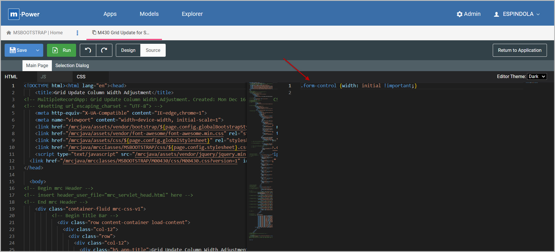
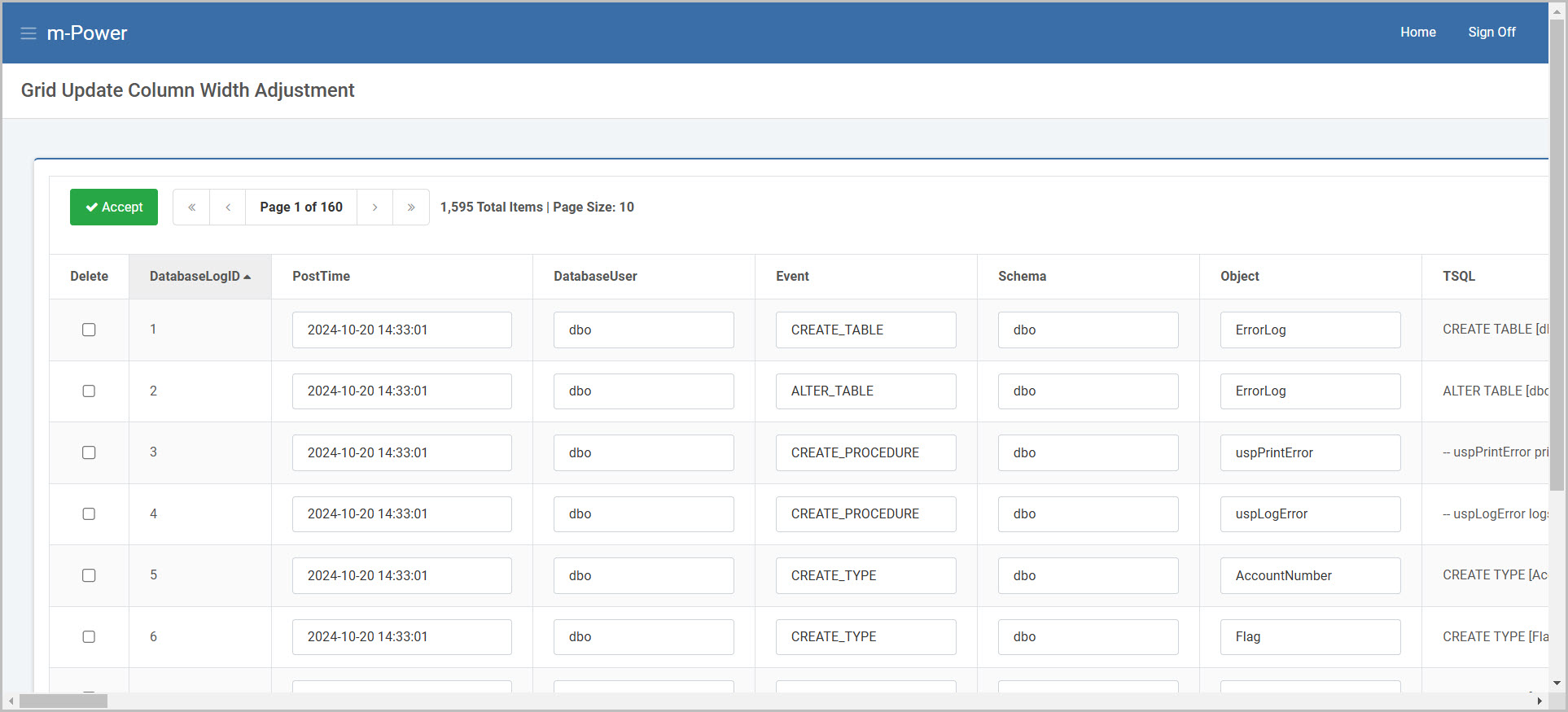
Save and run the application, observing the columns widths will be adjusted.
Individual columns can be adjusted further by adding the size attribute for the corresponding input element. This may be edited by using the ‘Edit HTML’ option, after clicking on the INPUT in the m-Painter editor:
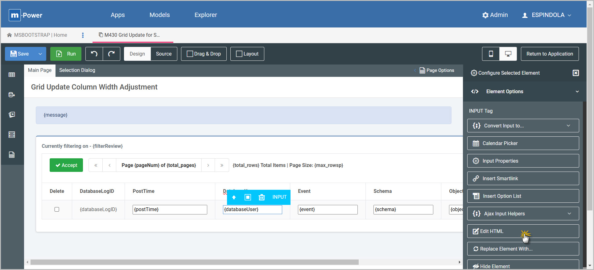
What follows is an example where size="8" was added:
<input class="form-control${errorClass}" id="DatabaseUser_grid${row_index}" ${disabled('DatabaseUser')} name="DatabaseUser" size="8" maxlength="128" value="${row.databaseUser?html}" title="databaseUser">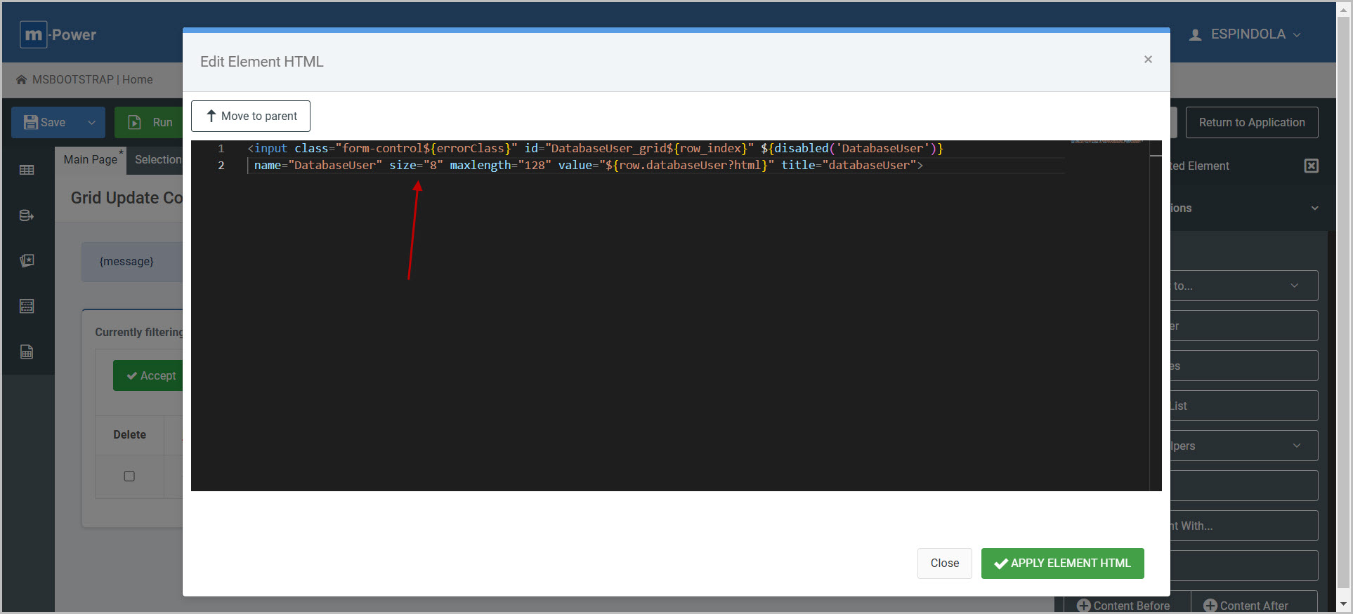
The larger the ‘size’ value, the larger the input box (and thus the grid column will be).
Adjusting columns without HTML inputs
This example shows a stock Multiple Row Data List retrieval application. By default, the data table’s columns will be as wide as necessary to fit the largest value within that column. Therefore adjusting columns widths is largely not needed.
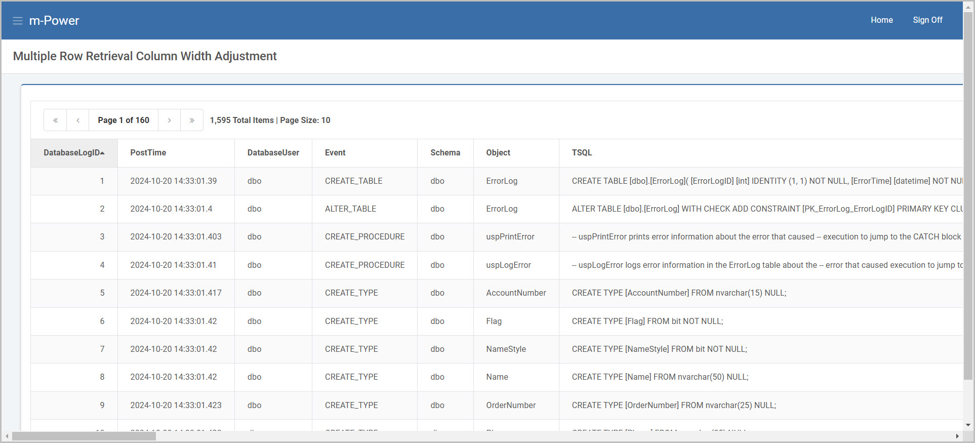
However when working with large text fields, there may instances where setting minimum (or maximum) widths is helpful to control the sizing of the columns in the presentation.
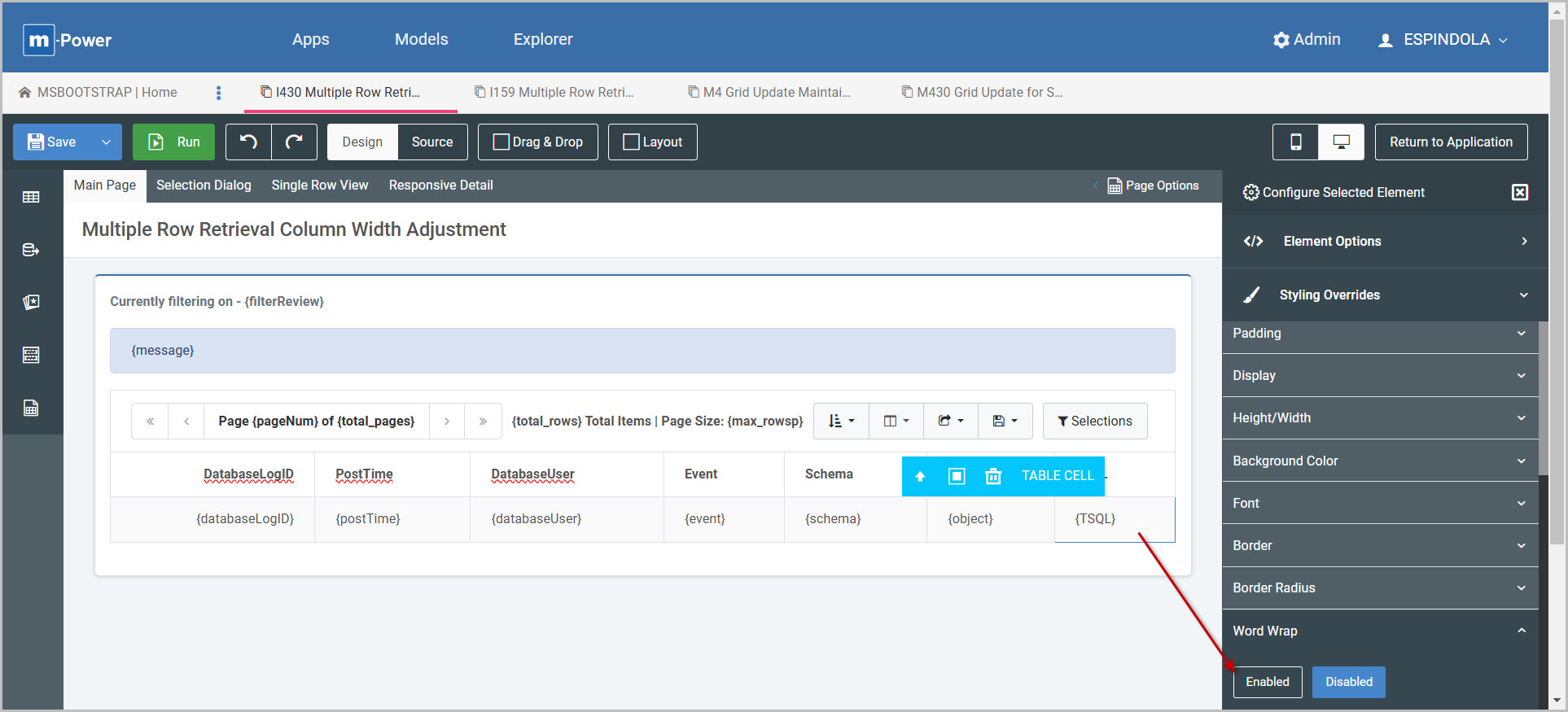
In this situation, I first select the TABLE CELL element where I can apply word wrap to wrap the text in the cell:
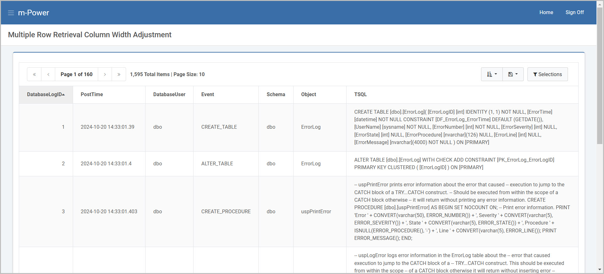
Then to explicitly control the width, add the max-width or min-width property as a style override to the cell:
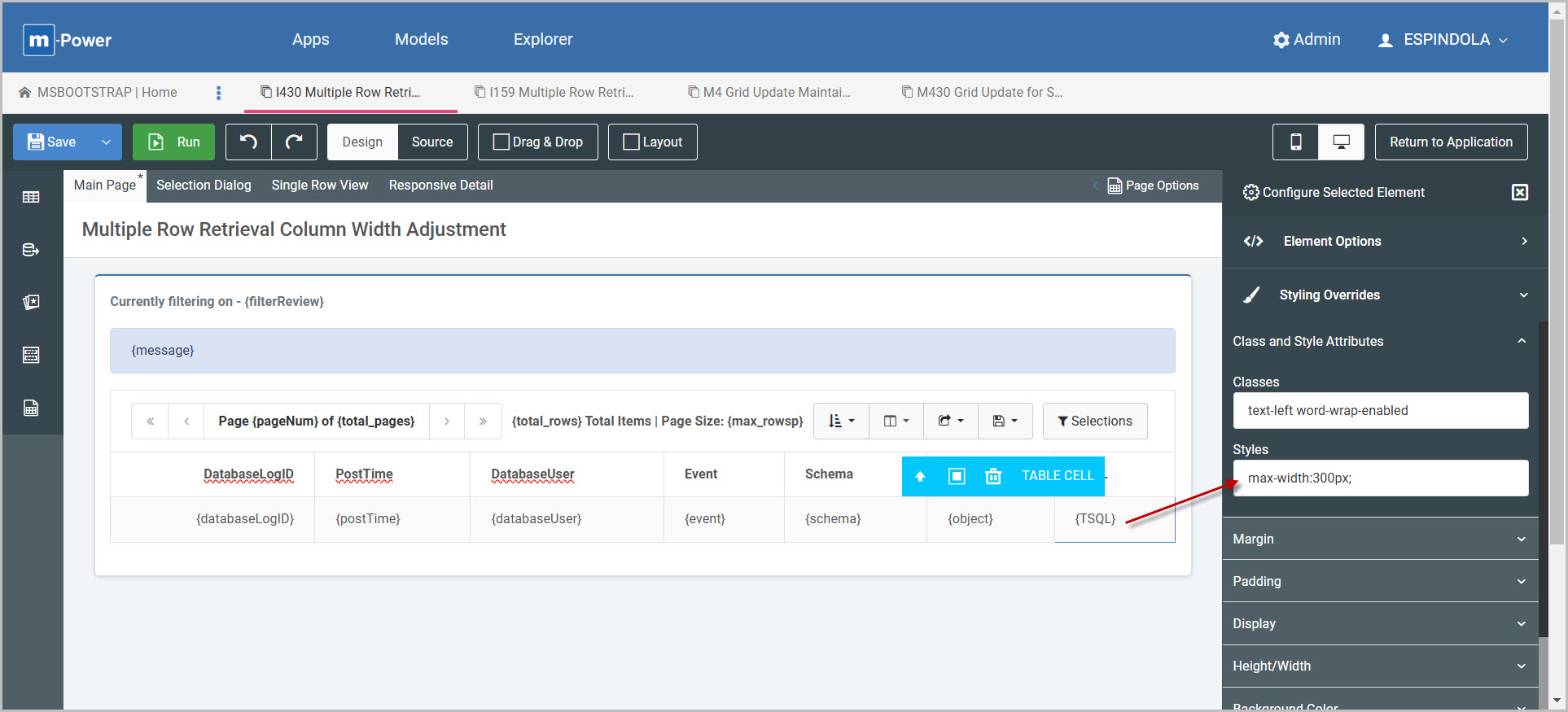
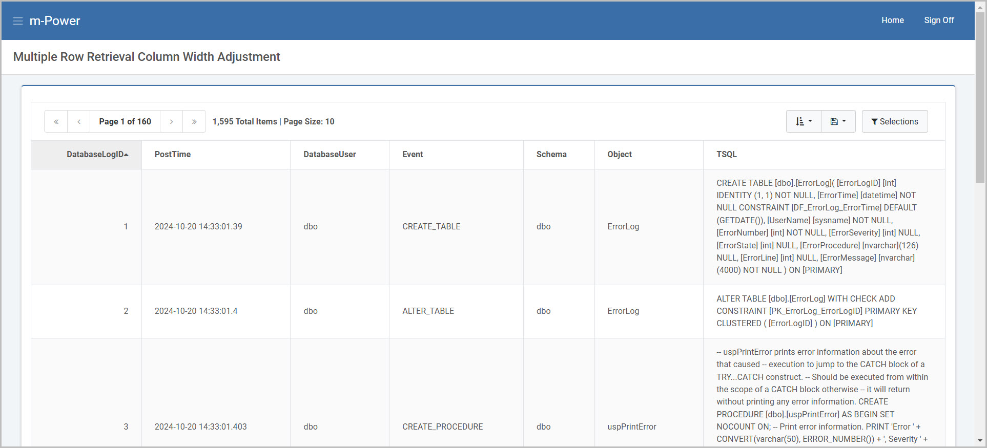
Adding max-width:300px; would ensure the column width is at most 300 pixels wide. This means the column width can be less and expand up to that value.
Adding min-width:500px; on the other hand would ensure the column width is always at least 500 pixels wide. This means the column width can be more and be no less than that value.
