Overview
AJAX (Asynchronous JavaScript And XML) is often used for interacting with a data server through a browser page without needing to refresh.
You have already seen AJAX in use with Multiple Row Data List Retrievals. As you enter text into a Selections input box, the page begins to suggest valid data for you! With AJAX m-Painter helpers, you can add similar functionality into all of your web applications.
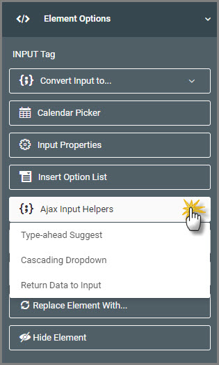
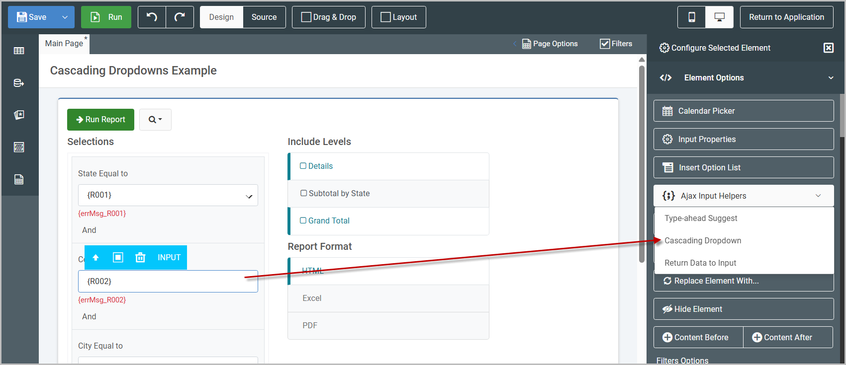
In m-Painter once you select an input, the Element Panel will open with an option for “Ajax Input Helpers”.
Each AJAX Helper feature will be discussed below:
Type-ahead Suggest
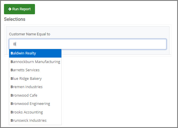
Type-ahead Suggest (formerly called AJAX Suggest) can be implemented on any input text box. When configured, as your end-user begins typing, the server will return a list of valid values. Users can either continue typing, or select a value from the list. Behind-the-scenes, the logic is passing the values entered in by your end-user and comparing that text to the value of a pre-existing field in a pre-existing model/application.
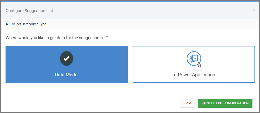
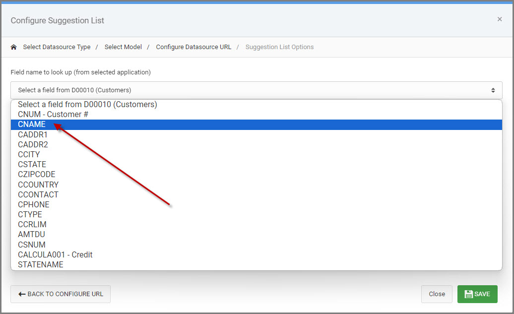
When you first select the Type-ahead Suggest option, a modal will open prompting you to select your datasource. This will be either a Data Model or an m-Power Application.
Next, select the pre-existing model/application to query the dataset.
Once the model/application is selected, you can include any additional URL parameters in order to filter the dataset as needed.
Finally, select the field from the model/application you want used as the “Suggest” field.
Click “SAVE”.
At runtime, a list will appear with matching values as to what the end user is typing in the input.
Ajax Cascading Dropdown List
One of the most popular and useful features in m-Power reports is the ability to create cascading dropdown lists. These dropdowns are designed so that the selection in one dropdown list dynamically influences the options available in subsequent lists. This functionality, powered by AJAX, is available across m-Power all reports and various maintainer templates.
Implementing cascading dropdown lists not only enhances user experience by providing relevant options but also helps streamline data entry by making it context-sensitive.
To add a cascading dropdown to your form, simply follow a few straightforward steps: start by selecting the initial dropdown, then configure subsequent fields to depend on it. Below, we’ll guide you through the process of setting up cascading dropdown lists, from selecting your data source to linking the dependent fields.
Example Walkthrough
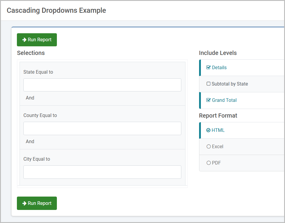
Below is Regular Report, with several runtime value prompt filters.
- State (R001)
- County (R002)
- City (R003)
The following is needed: A selection of State (R001) filters the list of counties (R002). Then, a selection of County (R002) will filter the list of cities (R003). To accomplish this setup, the filters will be configured as such:
- State (R001) will be configured as a standard option list.
- County (R002) will be configured as a cascading list.
- City (R003) will be configured as a cascading list.
After the first dropdown has been added to State (R001), select the next filter’s input box. From the Element Panel, select the “Ajax Input Helpers” -> “Cascading Dropdown”.
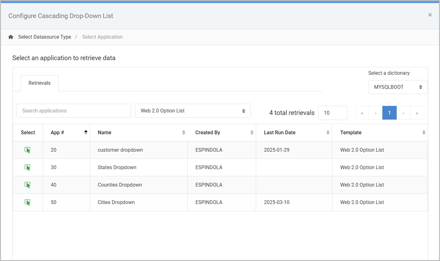
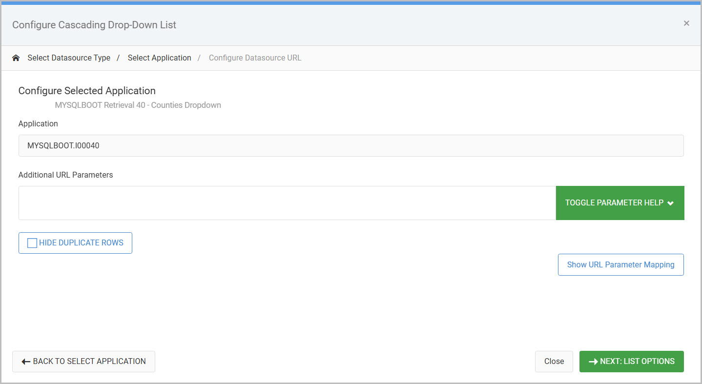
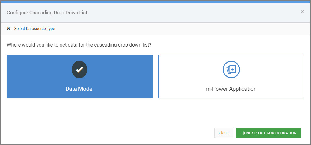
A modal will open prompting you to select your datasource. This will be either a Data Model or an m-Power Application (a Web 2.0 Option List retrieval).
Next, select the pre-existing model/application to query the dataset.
Once the model/application is selected, you can include any additional URL parameters in order to filter the dataset as needed (typically, a developer will not need to include any additional parameters here).

The last step is to set the “Cascading Drop-Down List Options”, where the necessary dependencies are mapped.
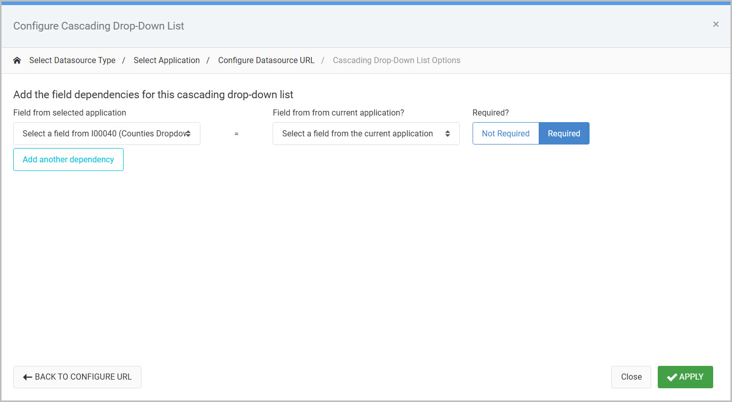
The following options are described in depth:
- Field from selected application (Left dropdown) – Shows fields from the data model or option list retrieval application.
- Field from current application? (Right dropdown) – Shows fields from the current application; in this case a report.
- Required?
- If set to “Required” – The mapped dependency must be selected before the end-user can select a value for this cascading dropdown.
- If set to “Not Required” – The end-user can immediately select from this cascaded dropdown without having to make a selection from the mapped dependency.
- Add another dependency – click to specify another dependency that will filter the cascaded dropdown.
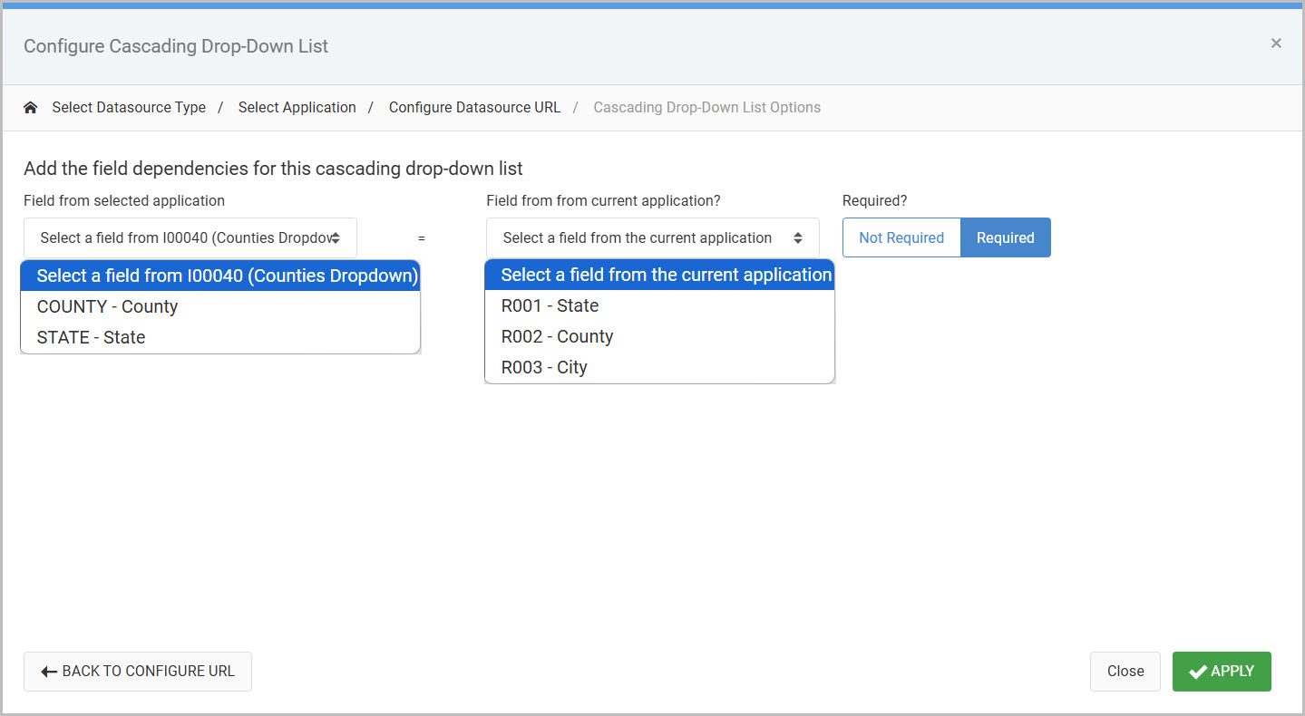
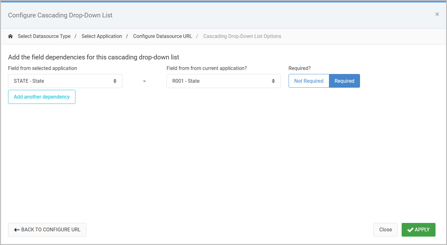
In this case a selection of a state from the previous dropdown needs to be passed to generate the appropriate list of counties. So that means the state field from the Web 2.0 Option List retrieval is mapped to its corresponding state filter in the report, R001.
Once finish, press Apply.
To showcase a cascaded dropdown with multiple dependencies, another cascaded dropdown will be inserted on the City filter (R003). The city filter will have two dependencies mapped, which looks like this:
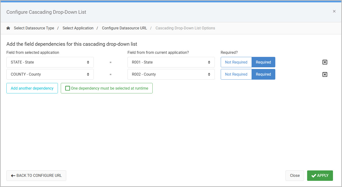
Both are set to ‘Required’, indicating a state AND county value must both be selected before a list of cities can be seen.
Note that if wanting the list of cities to be immediately accessible with the selection of either the state OR county value, a developer can select the One dependency must be selected at runtime button.
Click “Apply” once finished.
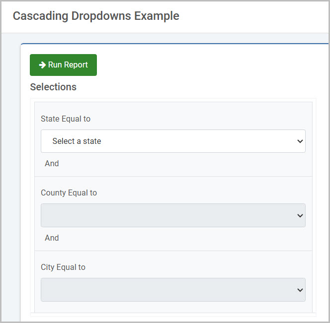
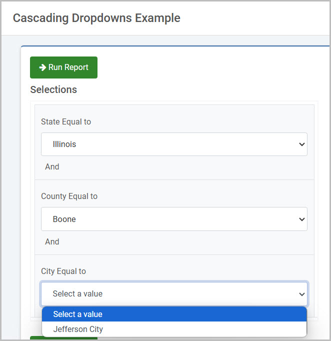
Finished Example
At runtime, the county cascaded dropdown is not selectable until the first dropdown has been selected.
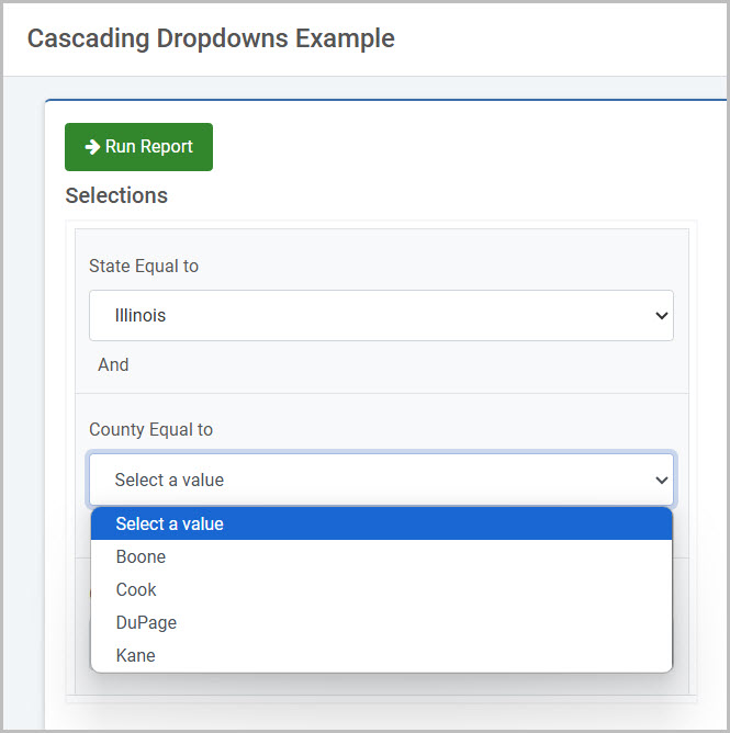
Once a state is selected, a county may be selected.
After which, the city list is filtered by the selection of the state and county:
AJAX Return Data to Input
The AJAX Return Data feature will populate one or more inputs in a maintainer based on one key field.
To implement, select the input box or dropdown where you would like to add your Ajax helper. From the Element Panel, select the “Ajax Input Helpers” -> “Return Data to Input”.
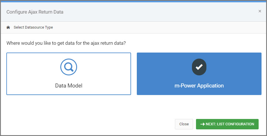
A modal will open prompting you to select your datasource. This will be either a Data Model or an m-Power Application.
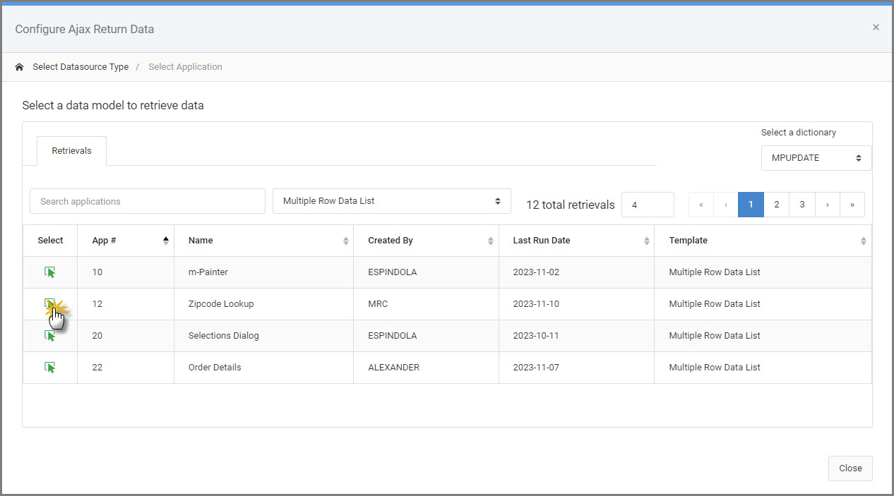
Next, select the pre-existing model/application to query the dataset.
Once the model/application is selected, you can include any additional URL parameters in order to filter the dataset as needed.
Next, use the “Field name to Look up” to choose the field you want used as the key field for your return data from your pre-defined app/model.
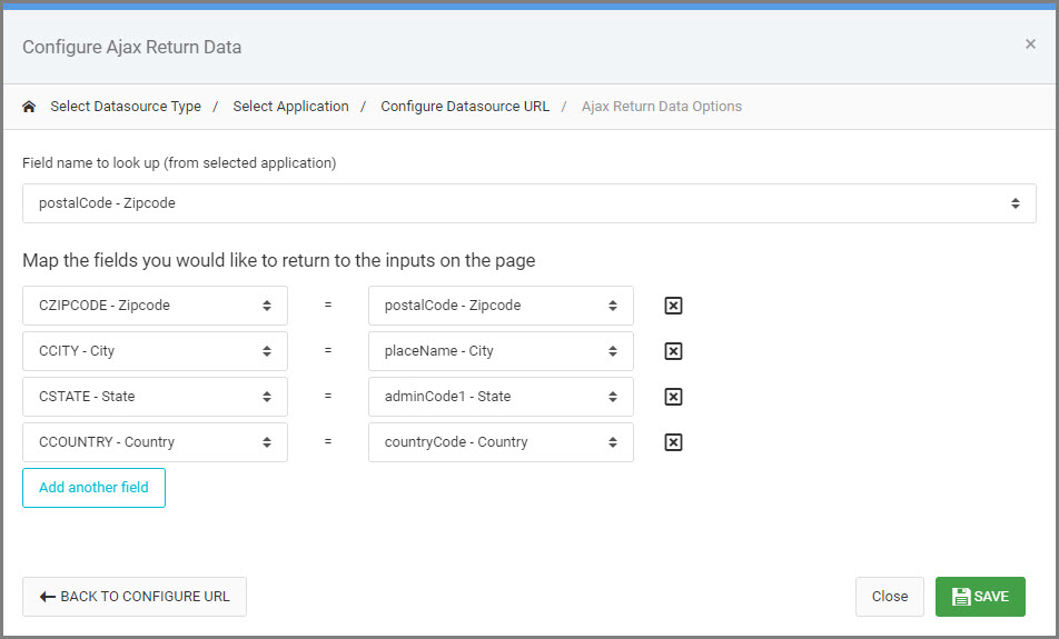
Map all fields that you wish to be returned by selecting the “Current App fields” on the left and the “Fields from selected app” on the right. Repeat as needed to fully map each field.
Click “Save”.
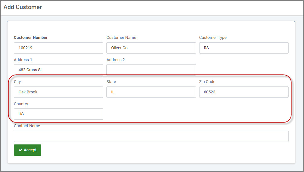
In the example screenshot below, after the Zip Code is entered and the user moves their focus away from the field (either by using tab, clicking on a different input, or selecting the value if using a dropdown), AJAX will go out to the inquiry, pull the relevant data, and return it to the inputs based on the field mappings made in the last step (City, State, Country).
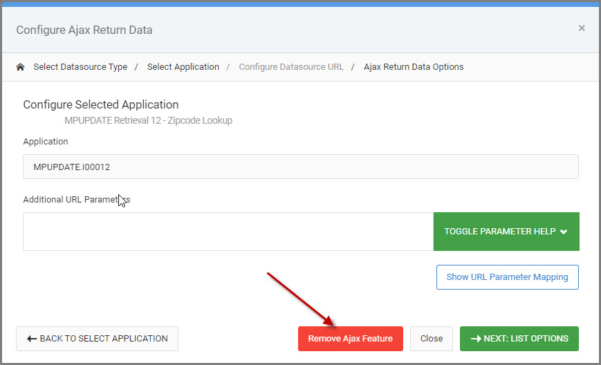
Remove Helper
In the event that you create an AJAX Helper but later decide you want to revert back to a standard Input box, use this option to remove any AJAX Helper.
To remove helpers, select the input box you wish to revert. From the blue context menu, select the “Quick Edit” option.
Select “Remove Ajax Feature” from the Configure Ajax Feature modal.