Overview
Dropdowns are a vital UX component that makes life easier for your end-user by giving them a choice of options at run-time, rather than a free-form text input. This documentation will explain how to implement via m-Painter.
Video Walkthrough
Implementation
Click on any input box. Within the right side element panel, select “Convert to…” and pick “Drop-down list.”
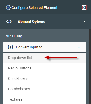
Select Data Source
You will now be taken to a Wizard that will help guide you through the process. The first step is to tell m-Painter where the data from your dropdown list will be located.

- Data Model — Choose this option if you would like to use a pre-existing data model (or would like to create one right now).
- m-Power Application — Choosing this option will let you select from a list of pre-existing Option List retrievals.
- Query Current App — (Not available in Maintainers) — This option will query the current application’s data to come up with a distinct list of available options. Depending on the overall size of the result set, this option could be quite slow.
- Quicklist — This allows you to create your own reusable static dropdown list. The best use cases for this are when the list of options is relatively low, relatively unchanging, and a database table for this list doesn’t exist.
Data Model Dropdown Lists
Select the Data Model you wish to use, or conversely, create a new data model. In either case, ensure that you have specified which field will be the List value and which will be the List description.

After selecting your data model, click the green “Next: List Configuration” option.
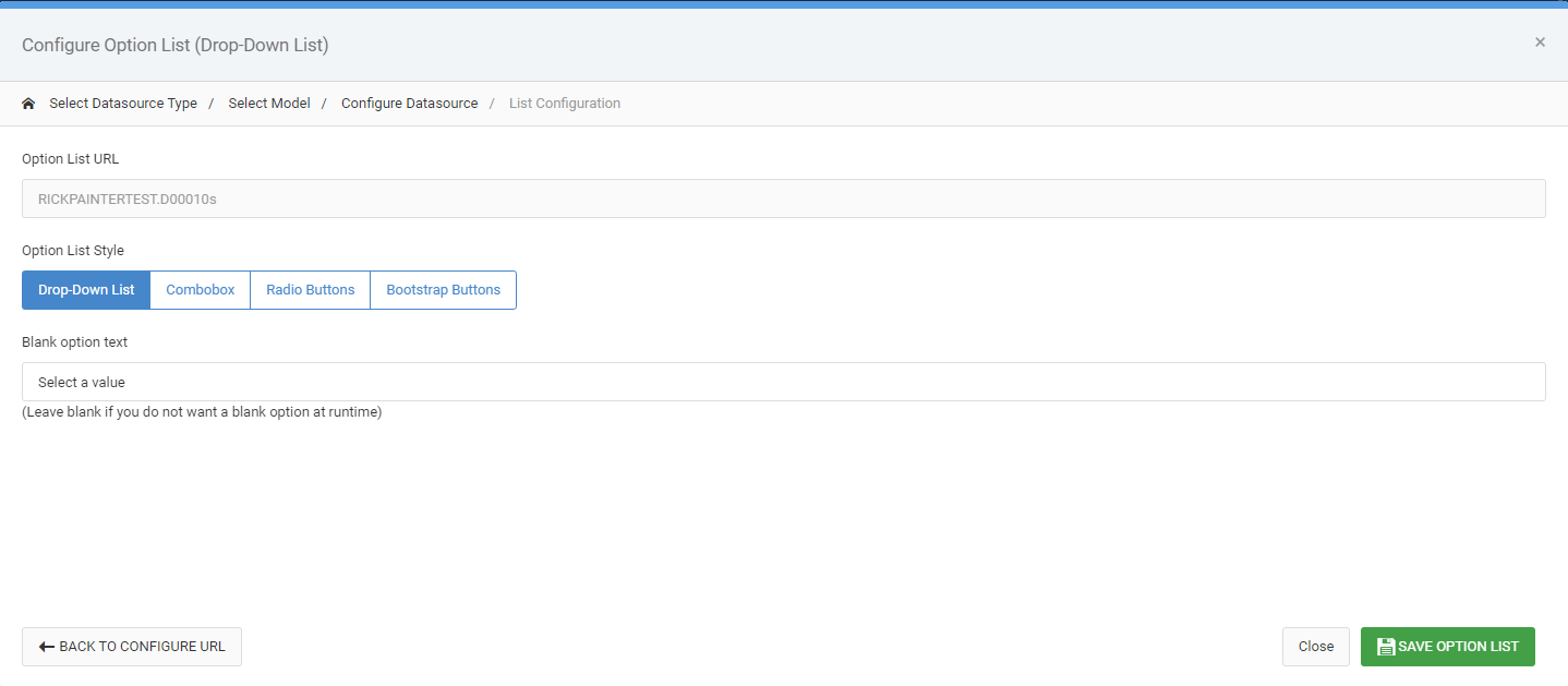
If you want your dropdown list to be required, remove the Blank Option Text. If you would like to change your dropdown to a different type, you can also do that here.
m-Power Application Dropdown Lists
Selecting this choice, you are brought to a list of all Option List retrievals built in this dictionary. After selecting one, click the green “Next: List Configuration” option.

If you want your dropdown list to be required, remove the Blank Option Text. If you would like to change your dropdown to a different type, you can also do that here.
Query Current App Dropdown Lists
As this option already knows where the data is coming from, you are immediately brought into the configuration screen:
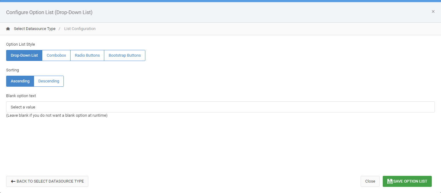
Choose Ascending/Descending to control the order of the data found in the dropdown list. If you want your dropdown list to be required, remove the Blank Option Text. If you would like to change your dropdown to a different type, you can also do that here.
Quicklist Dropdown Lists
More information about Quicklists can be found here.
After selecting an existing (or creating a new) quicklist, you will be brought to the configuration screen:
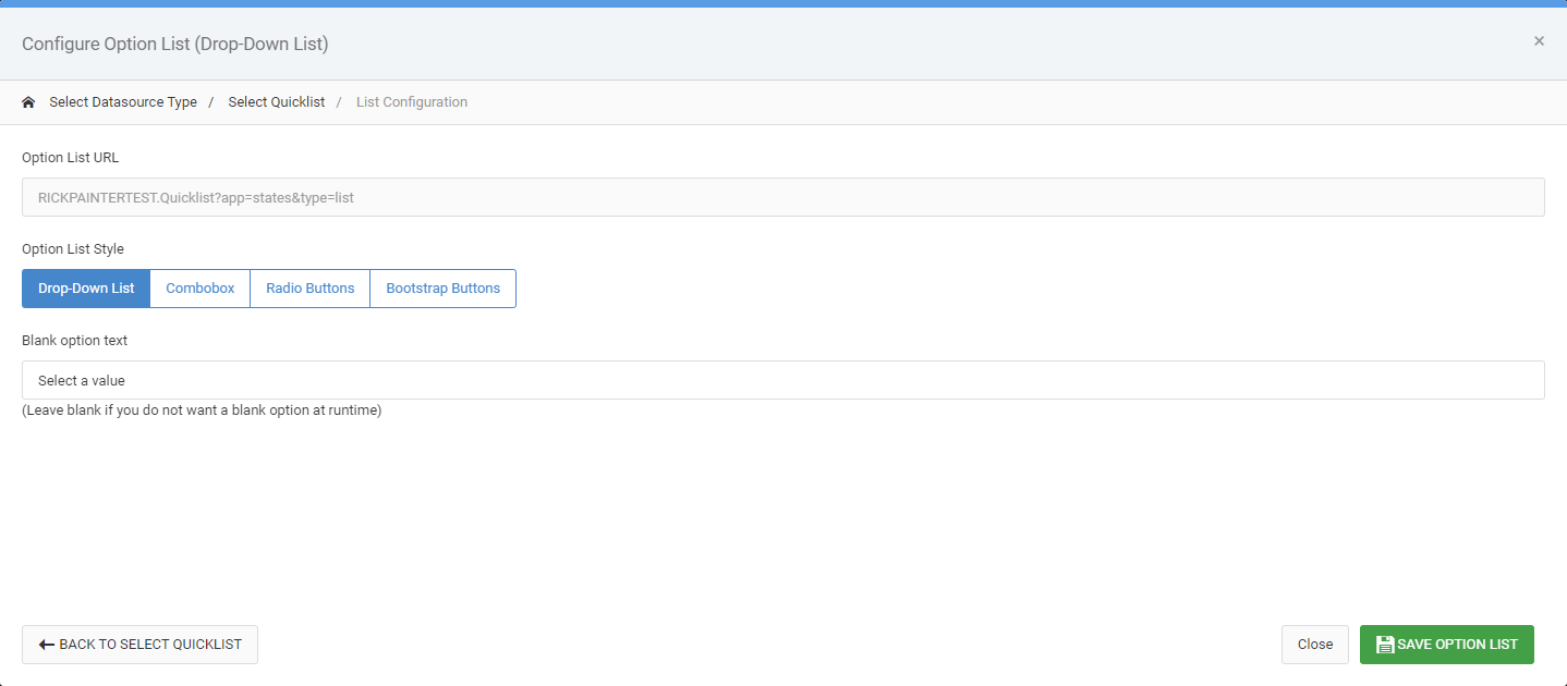
If you want your dropdown list to be required, remove the Blank Option Text. If you would like to change your dropdown to a different type, you can also do that here.
Non Dropdown List Options
While dropdown lists are the most prevalent choice in terms of replacing text boxes with predefined lists, m-Power supports these other options as well.
Comboboxes
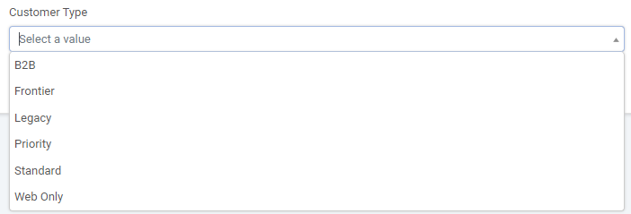
Comboboxes allow users to still pick an option from a dropdown list, but they also have the ability to type within the input.
Radio Buttons
Radio buttons will display all available options to the user at once. In m-Painter you can specify on how many options you would like to appear on each line.

Bootstrap Buttons
Like Radio Buttons, Bootstrap buttons will display all options available at one time. However, much improved, the area for a user to click the actual button is much larger so the user experience is improved considerably.

Checkboxes
Available in very limited use case scenarios, checkboxes allow your user to select more than 1 value. In m-Painter you can specify on how many options you would like to appear on each line.

Other Notes
- To remove a dropdown list, select the dropdown list and click the edit button within the blue menu. Then click the red “Remove Option List” button.
- If you select “Radio Buttons” and a “Blank Option Text”, the text will receive its own radio button.
