 Summary: Businesses have access to more data than ever before. But, is this data actually helping business leaders make more informed decisions? In many cases, the answer is “No.” Why? Far too few businesses actually capitalize on their data. In this article, you’ll learn how effective dashboards will help your executives capitalize on your data, as well as tips for building dashboards that work.
Did you know that data can actually hinder decision making?

As mentioned in Reuters, “Dying for Business” report, “One-third of managers are victims of ‘Information Fatigue Syndrome.’ 49% said they are unable to handle the vast amounts of information received. 43% think that important decisions are delayed and their abilities to make decisions are affected as a result of having too much information.”
We’re generating more data than ever before. We’re told that this data improves decision-making. We’re told that data can improve business.
But, that’s not entirely accurate. When properly managed, data will improve decision-making. When properly managed, it will boost the business.
The problem: Far too few businesses know how to capitalize on their data.
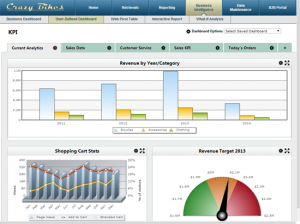
Today, let’s focus on one way businesses can better capitalize on their data: Dashboards. Dashboards display key business data in a single, easy-to-read display. They’re designed to give business executives a clear view of the business data that matters most.
The result of an effective dashboard: Clarity. Effective dashboards cut through the data and give business leaders a clear picture of the business.
The problem: Many dashboards fail in this aspect. Some display too much data. Others display unimportant data. How can you build effective dashboards that your C-Level executives will love? Here are a few tips:
1. Hold a dashboard workshop
The first step to any successful dashboard: Understand your audience.
Who will use this dashboard?
What metrics do they care about?
What do they hope to get out of this dashboard?
Now, this is easier said than done. What happens when users don’t know exactly what they want? What happens when multiple users can’t agree on what to include in a dashboard, or how it should look?
If these issues aren’t planned for, you’ll waste countless hours working out the details. You’ll deliver a dashboard that your users don’t like.
One way around this problem: Hold a dashboard workshop.
“The best way to identify what should be on the dashboard is to host a dashboarding workshop where the team define the objects and visual presentation of the data,” says Heather Cole, Business Analytics Speaker, Strategic Coach and President at Lodestar Solutions. “A software agnostic dashboarding workshop where team members create a visual representation of their dashboards on paper during an interactive dashboard exploration. Workshops eliminate the situation where report designers create dashboards only to find that the end users don’t use them. During the workshop the team should define a standardized template, including color and logo guidelines to provide a consistent visual experience for all dashboards. If the dashboard will be used on a mobile device the design must consider the limited real estate of mobile devices. Executives will not want to continuously scroll.”
2. Identify which data points really matter

As you’ll soon understand, users don’t always know what they want. They may want a dashboard, but don’t know what they want displayed on that dashboard. Or, they may want too much data displayed on the dashboard.
Your job: Identify which metrics really matter.
How?
As explained below, it starts with a simple question: Why do clients buy from you?
“Dashboards should reflect your company’s competitive differentiator and why your clients buy from you,” says Cole. “Your competitive differentiator is what your clients value. When the organization is focused on the unique value they provide to clients, it is much easier to hold margins and market share, even in a highly competitive market. Including the measure of your competitive advantage on your dashboard will motivate the entire organization to perform and improve the number, resulting in increased sales.”
3. Display what they need (and no more)
“We need to keep in mind that C-level people don’t have the same time that a marketing executive or IT manager has to dive into the nitty gritty,” says Ryan Knoll, Head of Marketing and Design at Report Pro. “With that in mind KEEP IT SIMPLE!”
“As a rule of thumb I always keep in mind, if I have to spend more than 2 seconds trying to figure out what the data is and why it’s important to me I’ve failed as a designer and the dashboard will not get used as much and eventually fail.”
Effective dashboards are simple dashboards. The more data you include in an executive dashboard, the more confusing it becomes.
How do you decide which data stays and which to leave off? Separate the metrics from the Key Performance Indicators (KPIs). What’s the difference? A metric shares information. A KPI leads to action. It influences a decision.
“Dashboards should be diagnostic,” says Margaret Reynolds, Master Growth Catalyst at Breakthrough Masters Unlimited. “Meaning, they track the levers that influence outcomes and lead to achieving goals. By understanding what works and what doesn’t you know where to spend your time and resources.”
4. Give them a way to get more data if necessary

Business dashboards provide high-level views of data. But, an effective dashboard provides more data as needed. An executive must have the option to click on a piece of data and drill down for more details.
For instance, suppose your dashboard tracks product returns. While the dashboard itself displays high-level data, it should also let the user drill down and see where the products are being returned, reasons for returns, and more.
“Keep it simple to understand and easy to interpret the data,” says Knoll. “That’s not to say don’t have the detailed data inaccessible but move it to another page or have a link people can click to drill down instead of showing it all up front. It can be intimidating even for C-level executives to look at sheets and sheets of data they may or may not need. Especially when you have limited time to sort through it all.”
5. Provide customization options
Over time, preferences might change. Executives may ask for additional data points. Some will want to view their data in a different format, or just rearrange the charts.
Plan for these changes in advance. An effective dashboard lets users customize the data they see on their dashboard, along with the layout. It lets them add or remove charts/graphs at will, and reformat the dashboard itself.
Rather than create new dashboards every time an executive requests a change, give them a single dashboard that they can customize.
6. Don’t forget design
What’s the only thing worse than not creating dashboards for your executives? Creating dashboards that no one uses.
Many developers fall into the same trap. They design a functional dashboard that meets all of the user’s requirements. But, they skimp on design.
Don’t make this mistake. With dashboards, form and function go hand-in-hand. Without a good design, the dashboard may confuse the users, or even drive them away.
“Once you have the data you’re trying to show narrowed down to it’s simplest and most important parts make sure you bring a designer in to clean things up,” says Knoll. “I’ve seen more positive reaction from adding colorful up and down arrows and large easy to read icons than I have adding whole new data sets. Getting a professional designer to help with this portion will go a long way.”
7. Review the dashboard using the “Reverse PEG System”
Anyone who has ever created a dashboard, report, BI app, etc… understands a simple fact: It’s easy to get pulled off course. User requirements change. The data changes. Sometimes the technology changes over the course of a project.
Your end result may look nothing like the goals set at the start. Before rolling out your dashboard, review it using the “Reverse PEG System.” As explained below, this system checks for three key dashboard aspects.
“I have found it extremely useful to follow the reverse PEG system when building dashboards for executives,” explains Aaron Deutsch, Co-Founder of TellThem. “Dashboards should enable an executive to:
Glance – It is important to enable a quick view of the data being presented. An executive should be able to glance at the dashboard and have a high-level understanding of the state of the business.
Explore – After glancing, an executive might have additional questions to answer. What is the change year over year? Is there a difference among regions? Enabling exploration is critical, as it enables the executive to get a deeper understanding of her operations.
Pinpoint – After exploring, an executive may need to identify specific takeaways. Is there one product or region performing abnormally?”
So, what do you think? Is there anything you would add to this list? If so, please share your thoughts in the comments.

Pingback: 7 keys to building dashboards for the C-Suite - Get HeatherizedGet Heatherized
Pingback: 7 Keys to Building Dashboards for the C-Suite - Lodestar Blog
Pingback: Dashboard Software – AO SEU GOSTO
Pingback: Compare 2021s Best Dashboard Software – ACESSO ONLINE GRATIS
Pingback: Dashboard Software – Marketing
Pingback: Guia para software de painel - VEJA GRATIS
Pingback: Top 10 Dashboard Software Recommendations – NO